The Best Neutral Tones for Your Most Timeless Space
Would you prefer a space that nails all the trends? Or would you rather have one that says “timeless beauty” long into the future?
If you’re investing in your home, you’ll probably want to go for Door Number 2 — the timeless home that feels beautiful to you and inspires daily serenity, sans expiration date.
The best part of design is creating something you love, and if you love it, it’s not going to go “out of style.” That said, there are definitely some design elements that will help you achieve a timeless look. One of those elements is… neutrals.
Why are neutrals so darn alluring?
When you think of sexy hues, I bet shades of charcoal and black or deep moody jewel tones come to mind first (LOVE those, get more here). Cream, taupe, and beige? Probably not high on the list.
I’m right there with you, but I think we should add neutrals to that alluring picture. Noir and khaki? Classic, chic combo. Taupe and white? Match made in design heaven. Deep navy and fresh cream? You spoil me.
Neutrals are timeless, calming, sexy, and classic — which is perfect for a home!
A lovely balance of neutral greys, warm woods, and a splash of nearly black. (source)
How can you use neutrals at home?
You can use neutrals everywhere, that’s the beauty. My advice when picking neutrals is to stick with one or two. If you’re going taupe, go taupe. If you’re going grey, stick to the grey family. Here are a few eye-catching examples to inspire you...
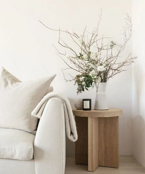
Neutrals go especially great with white and black. Sometimes restraint in design is just as important as balancing a lot of different elements. Being minimal and monochrome can be so bold! (source)
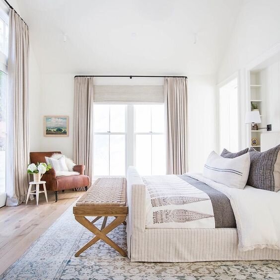
You can layer neutrals on top of each other for that comfortable, elegant vibe. source
Neutrals go well with organic or woven materials for a relaxing, stress-free vibe. And who doesn’t want to be relaxed at home?? (source)
I love how neutral tones emphasize the moody charcoal tiles and cabinets for a home bar that’s suave, sophisticated and endlessly stylish. (From our Modern Bohemian Project in SF)
What are my favorite neutral paint colors?
I know a designer isn’t supposed to reveal her secrets, but I can’t help it — it’s so hard for most people to select paint for themselves! The angle of sunlight plays a role, the color will interacts with your furnishings and flooring, and on and on. Below are some of my go-to paint colors, but if you’re at all unsure, I highly suggest booking a consultation with us. It will be time and dollars well spent to do it right the first time.
Sherwin Williams: Alpaca, Greyish, Greige
Benjamin Moore: White Dove, Chantilly Lace, Decorators White, Grey Owl, Revere Pewter
And if you’re looking for more inspiration, well, you know what to do… Pinterest board here. Until next time, sign up below for more updates + sneak previews of High Point Market (this month!!) and I’ll see you here again in November!
Xoxo,


