Our Top Picks for Simple, Beautiful & Clever Tiles
This gorgeous bathroom by the ever talented Courtney Bishop Design! Love this fun patterned tile on the bathroom floor.
Did you know people were actually ripping subway tile out of their homes left and right only a couple decades ago? Isn’t it funny how trends change?
Today, I want to take you beyond subway tile — not because I think it’s time for it to get lost again — but because there are SO many beautiful options out there!
So here’s a quick and beautiful lowdown on tile. You’ll find several tile types, designs, and plenty of inspiration. For more, head over to my Tile board on Pinterest …..just a little slice of design heaven (LOL!). But seriously, you’ll want to see these.
This floor is so adorable!! So many fun patterns with cement tile! (source)
First, Why Should You Use Tile in Your Space?
An excellent question! It makes a major visual impact, elevates the space with a high-quality feel, and most of it actually is as durable as it looks. You also have the added functional benefit of tile being majorly water resistant.
To Summarize:
Looks like a million bucks
Stands up to high traffic
Not going to suffer from water damage (*though some require a sealer, like cement tiles)
What Are the Materials Options for Tiles?
No surprise — tiles can be made from many different materials. I’ll list them here, but the pros and cons of each type could fill an entire blog post (or maybe even a book) on its own. So let’s stick to design and save that for another time.
Tile Materials Options:
Ceramic
Cement
Terracotta
Porcelain
Marble
From a design perspective, there are also a few different grout styles to choose from:
Match the shade to your tiles
Contrast the shade with your tiles
Minimal to no appearance between tiles
You’ll see some examples of these later on in this post.
The grout and tile colors are a near match. I love the color nuance of the square ceramic tiles here, too. (source)
Where Are Some Great Places to Put Tile in Your Space?
Maybe it’s obvious, but why not list ‘em out anyway? I find lists always make it easier for me to make sure I’m considering everything.
Kitchens:
Flooring
Backsplash
Avoid Countertops! They can look dated and there’s nothing more annoying than writing a honey-do list on a kitchen countertop made of tile!! ;)
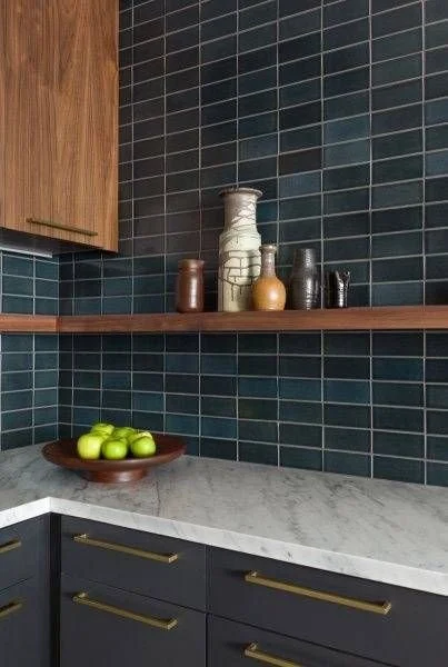
This clever backsplash feels sophisticated yet playful. Can’t get enough of it!
Bathrooms:
Flooring
Shower pan
Walls
Talk about creating a mood! (source)
Now, the extra fun part — let’s admire some more beautiful tile patterns!
What Are Some Looks and Layouts of Tile?
There. Are. So. Many. You have your classics, and then you the ones that are so new and creative they don’t even have layout names yet. I’ll cover the main ones here. Then you can go to my Tile Pinterest board to see just how creative the tile game is getting.
Straight, Brick, or Stack Bond Layout
The bond layout is more contemporary and great for accentuating straight lines and right angles. I especially like this look when you flip the tile vertically.
We actually used the vertical tile strategy in our recent Modern Bohemian design project in Bernal Heights!
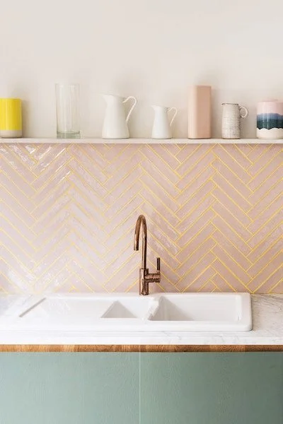
Herringbone Tile Layout
I honestly don't know if there’s anything more beautiful than an old herringbone floor pattern. I love this look with tile (or hardwood flooring), indoors or outdoors. This style has prevailed in European design for several centuries, so I’m willing to bet people here won’t be ripping it out of their homes any time soon either. Tasteful and timeless.
Diagonal Tile Layout
I love shifting a square tile 45 degrees and creating a diamond pattern. It’s just a little off the beaten path, but still looks crisp and classic. We’re seeing more diagonal patterns being created with rectangular shapes, too.
Love how the tile layout is different from bottom wall to top wall, top wall to ceiling! (source)
Really interesting diagonal pattern with gold edge metal. (source)
Basket Weave Tile Pattern
This pattern feels clever to me. It’s simple but gives a creative edge to classic subway tile.
Love the basket weave pattern with this classic subway tile! (source)
English Bond Tile Pattern
This style uses alternating rows of rectangular and square tiles. It’s another look that’s classic but has its own character.
Subway Tile
I know you’ve heard of this one. ;) Subway tile is everywhere these days, but I can’t deny there’s a reason for it — it looks pretty darn good.
Mermaid or Scallop Tile
This design is Moroccan-inspired and looks just like it sounds! The one big difference from the other tile styles is that the shape is rounded, not geometric. By contrast, they can add a fun and organic vibe to a space.
Love the touch of soft Moroccan glam these tiles add to the space. (source)
Mosaic Tile Pattern
I mentioned this style in a few of the images above, but to explain, it’s an assembly of different colors or shades in the same shape. We used a very subtle mosaic tile for the kitchen backsplash in our Modern Bohemian design project in Bernal Heights, and it looks really classy!
Uniquely Shaped Tile Patterns
These are my favorite, and I could quite literally look at interesting tile shapes all day long. I reined myself in and kept it to 8. (I know, what kind of limit is that?) Don’t worry, the rest are in my Pinterest board!
How do you feel now? Relaxed? Soothed by the beauty? Me too, and there’s more where that came from… to keep the tile inspiration going, browse my Tile Pinterest board.
ENJOY! :)


